|
THE OPENING is all about introducing the fascinating, quirky and wonderful people working in and around the visual arts in Vancouver. Each week, we'll feature an artist, collective, curator or administrator to delve deep into who and what makes art happen! |
Neil Wedman graduated from the Vancouver School of Art in 1977, after having studied media, film and photography. Since then, he has made his name as both a painter and media artist, having shown both locally and nationally in exhibitions and film festivals. Neil spared a recent afternoon for coffee, burgers, and ice cream, and a good long conversation about his body of work to date.
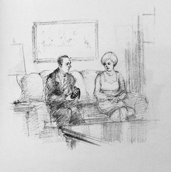
Plate from 'Burlesk', 1999
I'd like to start by asking you about the Burlesk book. You decontextualize these tiny, single-panelled comics. You make them more realistic, and you give them this grim atmosphere. You weave them into a narrative: certain ones repeat, certain ones become more detailed.
I was really happy with it. I do think that I should have made it more into a narrative. As a narrative now it's fairly poetic; it beats along with a certain kind of rhythm. I sometimes wonder if I shouldn't have made it more narrative. The thing is, if it was more straight-forward, then it would become a graphic novel. That doesn't interest me that much. I guess the thing is, narrative kind of fascinates me, the function of narrative and the structure of it. It's interesting, but I don't care for it that much. As a painter, you always try to get away from narrative. You always try, especially as a painter who has done quite a bit of figurative painting. In fact, all my paintings are recognizable as something. People always ask you, 'What's the story behind this?' and you try to disavow that, get away from trying to tell stories. I know it comes up all the time. People say storytelling is important. It's a part of our culture, it's a part of the way we transmit information. I'm absolutely not interested in storytelling. When I watch a movie, I consider the narrative a necessary evil.
So what is it you're invested in?
I think I like the structure. I like the formality of it. I like the images. I can watch non-narrative films without any problem. I'm most happy with a film when I don't know what's going on. I just watched Planet Terror the other night. That's a good one. You don't know what's going on for practically half that film. When they do finally tell you what's going on, the reel goes missing, and all of a sudden the rib shack is on fire and everybody's friends and everything's been explained. I really like that. I think that's great, and I think that film very much is about the experience of watching a film without really having to tell you a lot of story. They just use a lot of conventions, so you can follow it because you're familiar with the conventions of the narrative, but you don't really need that much of an explanation.
In terms of Burlesk, I think I deliberately wanted to stay away from narrative. Michael Turner was behind that project, because it was on his imprint at Arsenal Pulp Press. It was his idea to make it a novel. I was just going to make it a series of drawings. I think that to convey it as a novel and to have a certain kind of repetition in it did make it much more structurally sound than just a folio of drawings. The whole cover design was taken from a book by a guy named Walter Karig, and the book was called Zotz. It's an illustrated story about a guy who can point his finger and say “Zotz,” and have an effect on things. The cover design was very good so I based my cover on it. The beginning of the book starts on the dust jacket like that. It makes the text something else, a little like the illegible catalogue. It becomes much more a part of the design, in an overt way that might be more noticed by people who don't normally notice those kinds of things.
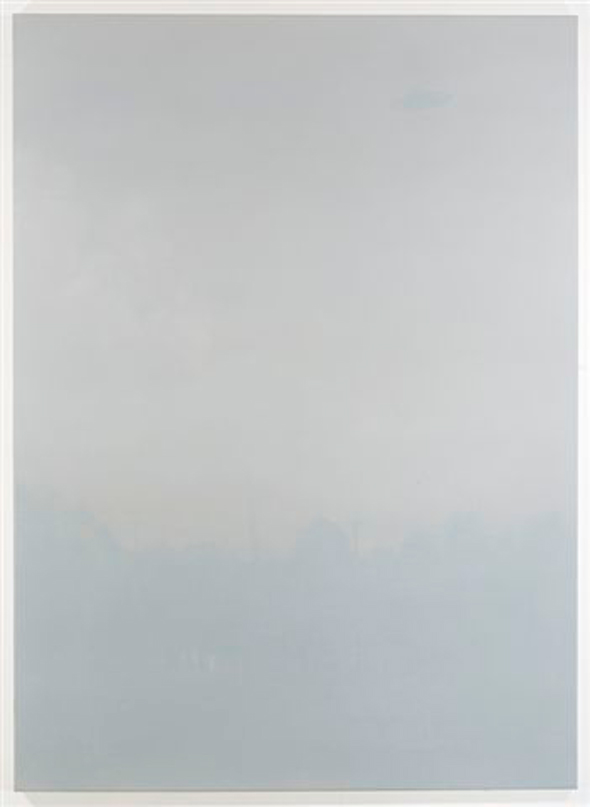
'Untitled Flying Saucer Monochrome #3,' 2006-7, oil on canvas, 48x72 inches
Also, Pyramid Power had a feature of cartoons in an early issue. For that, I'd done the same principle as in Burlesk, but I kept the cartoons as cartoons. They were more like collages, and they have captions on them. The captions are taken from a book called Breakthrough, recordings of dead voices. A guy named Dr. Konstantins Raudive in the 1960s did a series of experiments taking clean fresh tapes, putting them in a tape recorder in a sound-silent room, and turning them on. When you played them back, you'd hear very faint voices. It's called Electronic Voice Phenomenon. There would be Goethe, and Hitler, and all sorts of famous people taking to him in all sorts of languages on the tapes. Also a lot of nobodies. There was one woman who was always referred to as Anna Butterfingers, and I liked that. I took a lot of phrases for that and used them as captions for cartoons. I just paired them together if they looked appropriate. I think Pyramid Power is the only time it's been published in any way.
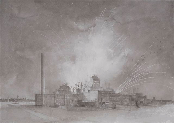
'Fireworks Factory Explosion #4,' 2010, pencil and ink wash on paper, 22x30 inches
Going back to this idea of you being more interested in the formal and structural elements of a movie, how does that exercise itself in the way that you work, this interest in content over narrative?
I think that in the monochrome paintings, both in the ones that I'm currently working with and in all of them in general, they all deal with spectacle and the picturesque. Right now I'm doing rainbows and exploding fireworks factories. Which is sort of a joke, right? I mean, an exploding fireworks factory is the ultimate spectacle, and so there's definitely a kind of comedic intent in making black-and-white paintings, grey paintings, and not very high contrast paintings of that sort of spectacular imagery—imagery that is almost traditionally and banally picturesque. And to render it in grey tones draws your attention away from subject matter and turns it to consideration of a flat picture plane, and the consideration of subjecthood and why the subject is interesting. It transforms the subject, sometimes in ways that are unexpected. The rainbows look something like garden hoses. They kind of take on a solidity that creates a completely different reality in the picture. A black-and-white photo of a rainbow still looks like light. This brings up the whole issue of why you make things in the first place. How you make them, and every brush stroke and all the gestures that go into the hyperbolic surface of the painting become the subject. Hopefully the potency of the subject is transferred.
The UFO paintings are more subdued in another way. They're sort of glazed over, so they're like looking through atmospheric fog. You see just a little bit. Really it's just a silhouette, a very grey silhouette against a lighter grey background. They're done with glazes as opposed to rendering things in just slightly off-kilter tones. Similarly, they're slow-acting. You have to look at them for a while before you can recognize what they are, and when you do recognize what they are, they're just a fleeting image of this sort of specular reality, the flying saucer imagery. I was quite happy with them, and I want to do something more with that particular approach of making things flatter, less contrasted. The rainbows and fireworks factories are more readable as black-and-white paintings.
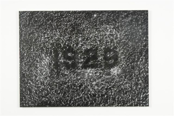
'1929,' 2007, sidewalk frottage/light-jet print, multiple of nine, 25x30 inches
You were featured in another issue of Pyramid Power with a body of work that focuses on sidewalks.
Those were the beginnings of the monochromes. In 2007 I was making those and making the flying saucer paintings, and I was also doing some illustrations for Jerry Pethick's Time Talk project. His work had a connection to them because the piece had this monochromatic cement-like structure. It had been sitting underwater for a couple of years, attracting electrostatic charges, so it got a crust on it, this really grey patina. I was working on that, and the sidewalks seemed somehow to be connected. The sidewalks originate from my own experiences of rambling, of walking. I believe the correct term is the saunter. I was walking around town photographing sidewalks—the dates but also the footprints and things that would occur near the dates. When I lived up in Dunbar many years ago, I lived in MacKenzie, nearby 30th. There was a 1930s sidewalk, dated, and it had dog prints in it. It was amazing. 1931, somebody laid that sidewalk, and then a dog walks through it. That dog is gone, that dog's dogs are gone. I was always intrigued by that particular sidewalk, and so I began photographing dates. And I thought I could get every single year, like butterflies, but I can't. They're not dated for every year. There are certain years that just aren't dated.
Melanie O'Brien at Artspeak asked me to do a tour for the Territory show in 2006, and she said I could do anything I wanted. I picked an area out that I thought had interesting sidewalks, interesting dates, interesting things to talk about, and then I did the real research. That was helped by several people. When I first did the tour, I figured that just listening to me wasn't enough. I had one of my ex-students, Steve Hubert, and his wife, Meg, doing rubbings of the sidewalks, so everybody got a rubbing. When I saw them, I realized that I could actually reverse them, and they would look like stars in the sky with a date. Then I scanned them, the drawings. They're just on graphite paper. I scanned them and reversed them to what I guess was basically the positive. But they're negative. The look negative, but actually they're positive because the rubbing is a negative. It's using the latest digital technology to replicate the very beginnings of photography, the paper negative. And they are light jet prints, so they are photographs. They're mounted on aluminium. They are in a show in Kamloops Art Gallery that opened this month, On the Nature of Things. They connect in a curious way to my pursuit of grey paintings.
So that came out of my habit of wandering. I always liked that aspect of being an artist, which is sort of being kind of idle, and just wandering around aimlessly.
'Moon Turn the Tides... Gently, Gently, Away,' 2004, oil on canvas, 51x51 inches
Bus stops are important to me because I don't drive. And the race track was more important to me then than it is now. It just seemed like a good destination to me, because I used to go to the races. They have a certain passing parade comedy to them. But at the same time you do also see the guys with their beaten down clothes, and the one pinky ring they got from their good day at the track. You can ride the loser bus home and see all the guys who are hitting themselves in the foreheads with a rolled-up racing form. But most of life is like that, tragic and funny at the same time.
Were you satisfied in the directorial position with the bus stop series, where you directed another photographer? Christopher Brayshaw likened it to your moving into this Vancouver school territory.
I never thought of it that way. It was so documentary. It came out of an idea where I'd been taking the bus for years and years downtown from MacKenzie Heights. There was a time when we were always going downtown to the Railways Club or to the Bodega Bar just about every night, and you always took the bus. In the 1980s, landscapes were changing a lot because real estate prices were sky-rocketing, and people were shoe-horning these monster houses into places where there used to be little bungalows. I thought it would be interesting to take pictures of every bus stop. I found a way of incrementing it. You just take everything that was around that bus stop. That was what you got. Otherwise, you were just making too many decisions. If you just take a photo of the bus stop, and then over time you could just see how it changes. That was the original impetus. I know there was a ten year anniversary of that project, but the buses weren't running down the same street at that time. They were running down Granville when we did it, and they are now, but during the Van City Olympics they were running down Seymour.
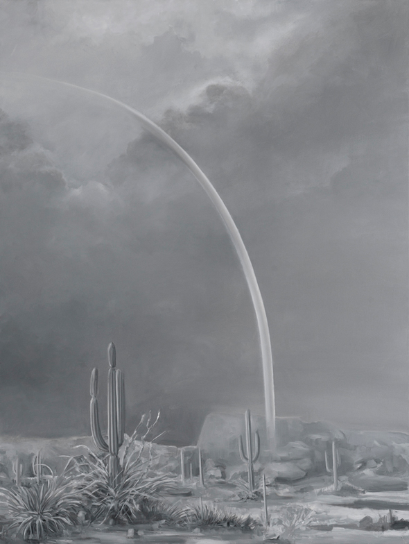
'Desert Rainbow #3,' 2010, oil on canvas, 44x60 inches
You have this interest in EVP, and you have these series of seance paintings, UFO paintings. There's this outward interest in the paranormal. Is it genuine interest, or is it more ironic appreciation?
It's not genuine interest. But I guess it's a genuine interest in the social beliefs that give rise to those kind of things. But I don't participate in any way to flying saucer research. In my case, I guess I do gravitate towards transgressive ideas for subject matter. I don't know if transgressive is the right word. Bizarre. I like things that are unusual, or weird. I've always liked that. I've always liked monster movies. I was more interested in spiritualism as a social forum, in the kind of way that people try to make visible the invisible. It's like my grey paintings: you open up the meaning. Something with a particular kitsch property to it is very limited in its meaning. If you suddenly render it in grey, it's open to more interpretation. It's neutralizing the colour, the appealing parts of the image, to look at the form of the painting. In that way, that's just what artists do. You take something from one place and open up its potential meaning. It's not really anything remarkable.
-------------
Neil Wedman has a couple of shows coming up: there will be a show at the Equinox in January. The working title is Selected Monochromatic Paintings and Works on Paper, Part 1 (2007-2011). That precedes Selected Monochromatic Paintings and Works on Paper, Part 2 at the Charles H. Scott a year later. And between that, also in January, he has a show opening at the Richmond Art Gallery with Stuart McCall, who shot the bus stop photographs. McCall shot photographs of Vander Zalm's Fantasy Gardens. When Vander Zalm went to trial, Neil did some court room sketches. The photographs will be shown alongside those sketches.
All images courtesy Neil Wedman.