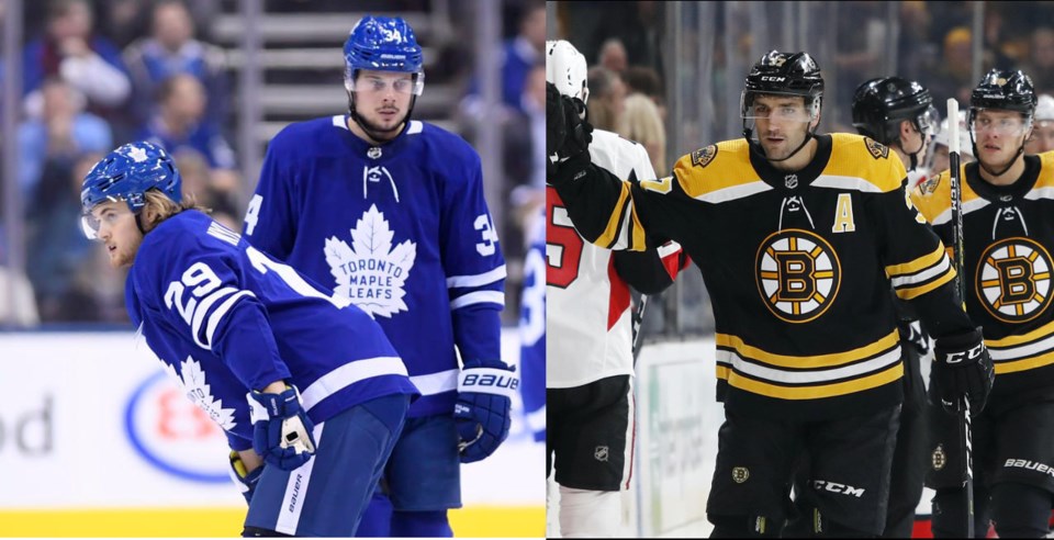
The 2019 NHL playoffs kick off on Wednesday with five games. The first round of the playoffs is the most wonderful time of the year for hockey fans, with multiple meaningful games on TV every single day. Sure, it’s tough for the fans of teams that didn’t make the playoffs, but it’s still some of the best hockey you’ll ever see.
In fact, there’s almost too much great hockey to watch. With eight first-round matchups to choose from and multiple games every night, it’s impossible to watch them all without some sort of multiple TV/tablet setup. Even then, your focus will be split. You need some way to decide which series will get your full attention.
You could base your decision on the series that is likely to provide the most entertaining hockey. Perhaps you have a favourite player or team (aside from the Canucks) that will influence your viewing decision. Or maybe
There’s another way to decide, however: which series is going to be the most pleasant viewing experience for your eyeballs? By that, I mean which jersey colours, when together on the ice, will look best? Let’s figure out which playoff series have the most aesthetic appeal.
In order to figure this out, I’ve recruited a graphic designer friend of mine, Daniel Giesbrecht. He has a great eye for colour and once won a fantasy hockey league that we were in together, so he’s eminently qualified to provide some colour commentary.
Heh, colour commentary.
8th | New York Islanders vs Pittsburgh Penguins
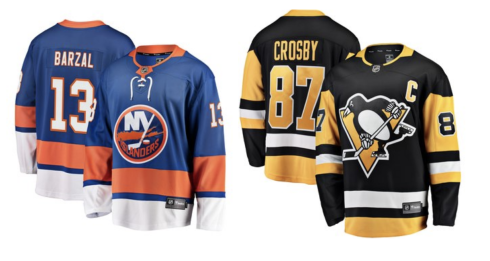
What an utter disaster of a matchup. Sure, the idea of the upstart Islanders facing the dynastic Penguins is intriguing, but look at those two jerseys side by side. Everything is clashing here. The blue, orange, and yellow provide a split complementary colour scheme, but there’s something a little off about it. When you toss in the black from the Penguins, it just doesn’t work.
Giesbrecht agrees: “This one is loathsome to mine eyes. Eliminate that orange, it’s ruining everything. Help!”
7th | Calgary Flames vs Colorado Avalanche
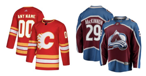
The Flames have declared they will be wearing their retro alternate jerseys in the playoffs, which is good, because they are far superior to their regular home jerseys with their black logo and unnecessary black accents.
Unfortunately, the bright red and yellow clashes horribly with the burgundy and blue of the Avalanche.
“The epic confrontation of fire and ice provides a dramatic visual,” says Giesbrecht, “but I also kinda hate it. Maybe it’s a colour temperature disparity thing; then again, maybe that in itself is the whole point.”
Daniel makes a good point about the fire and ice symbolism at work in the Flames and Avalanche, which makes it ripe for Game of Thrones parallels — A Song of Ice and Fire —but there’s another aesthetic element working against it as well: the retro Flames jersey alongside the modern aesthetic of the Avalanche jersey is throwing me for a loop. That retro jersey would be ideally matched against another retro jersey, or at least another jersey that has stood the test of time.
6th | Nashville Predators vs Dallas Stars
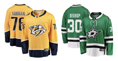
On first glance, this is a bright, colourful, fun combination. The gold of the Predators and the green of the Stars seems like it could work. When you go to the secondary colours, however, things go awry.
“The navy blue and black need to decide if they want to be distinct or be consolidated,” says Giesbrecht. “Choose one or the other and stick to it, or make the difference more blatant.”
Agreed. The navy accents on the Predators and the black on the Stars are a bad combination, but Giesbrecht isn’t sold on the primary (heh) colours either.
“I’m undecided on how I feel,” he says. “Maybe brighten the Stars’ Victory Green a touch, or make it teal?”
Speaking of teal...
5th | San Jose Sharks vs Vegas Golden Knights
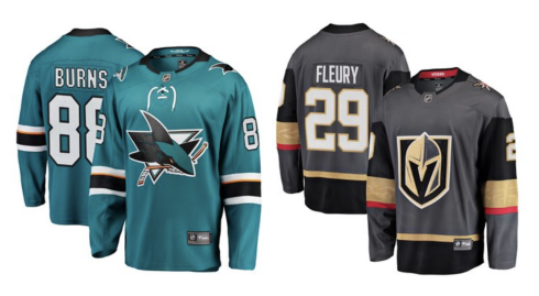
“Points for some of those tertiary, less conventional colours,” says Giesbrecht. “Points for both owning that true black too.”
The unconventional nature of both of these jerseys sets this matchup apart. No one else in the league has teal like the Sharks or the metallic sheen of the gold of the Golden Knights. On top of that, the teal and gold actually work pretty well together. There’s just one problem.
“I would have liked this combination more, but the Golden Knights’ hint of red and the Shark’s hint of orange seem irreconcilable to me,” says Giesbrecht. “Take one or both of them out, I’d say: they can do without, no? They are rather inconsequential to the overall composition if you squint.”
To be honest, I’ve never liked the hint of red in the Golden Knights’ jerseys.
4th | Winnipeg Jets vs St. Louis Blues
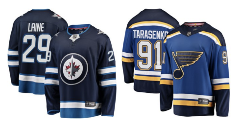
I’m not a huge fan of either of these jerseys on their own — I wish the Blues were wearing their retro alternate jersey like the Flames — and I was prepared to rank this series lower, but Giesbrecht convinced me that this combination works.
“The navy blue on each is the same Pantone! 282!” he says. “The mid blue for each is rather close, so points for colour unity. The war is between the red and yellow, which is kinda fun. However, it’s a rather primary colour scheme overall, so a few points deducted for unoriginality.”
I almost feel like the secondary blues on these two jerseys are too close, to the point that they make you wonder why they aren’t the same colour, but I’m not a professional designer. The matching navy blues is pretty neat.
3rd | Boston Bruins vs Toronto Maple Leafs
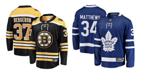
It’s a classic Original Six matchup featuring two classic jerseys, but it’s not as aesthetically pleasing as some other Original Six combinations. Leafs and Canadiens, with their bold reds and blues, would be ideal, or Rangers and Blackhawks. Instead, we get the Bruins with their black main colour, which doesn’t quite pop the same way against the Leafs’ blue.
“It’s not bad,” says Giesbrecht. “There’s not too much going on in the colour palette, so it looks pretty clean. And the blue and yellow — though they call it “Gold,” I guess — are close enough to complementary.”
Agreed: it’s clean, simple, and classic, so it works.
2nd | Washington Capitals vs Carolina Hurricanes
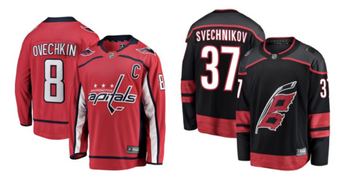
I’ll be honest, I’ve never liked the grey yoke on the Hurricanes’ alternate jerseys, which they’ll be wearing for the playoffs. Opposite the Capitals’ jerseys, however, this works pretty well.
“I’m a sucker for analogous colour scheme!” says Giesbrecht. “The reds play off each other pretty well. The navy/black disparity doesn’t come across too strong because the use of the Caps’ navy is limited.”
Personally, I think a pop of another colour in the mix would step this scheme up a notch, but this works.
1st | Tampa Bay Lightning vs Columbus Blue Jackets
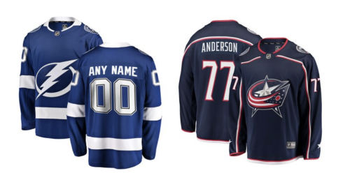
There we go. Like the Capitals and Hurricanes, this features two analogous colours in the blues of both jerseys, but adds an additional splash of colour. This is a bold choice at first — neither of these jerseys on their own are favourites around the league — but the combination of the two together is aesthetically appealing.
“This one sits really well with me,” says Giesbrecht. “Tampa Bay’s blue works in perfect conjunction with Columbus’s Union Blue, and neither of them clash with that Goal Red. A masterpiece of a match-up!”
What do you think? Did we get these ranks right? Sound off in the comments.
