
From a design standpoint, this is my most favourite time of year: the fresh, rejuvenated energy that comes with the first tease of spring runs through the city like electricity, boosting spirits and driving a desire for vibrancy and change in our environments.
Neighbourhoods are buzzing with interaction, and gatherings (both impromptu and planned) are on the agenda. It’s as if the sunshine and cherry blossoms remind us that we are social creatures, and everyone is keen to add new life to their abode in preparation for entertaining.
For me, it feels like the perfect time to begin this super fun opportunity to connect with our city’s communities through this WE design column; I look forward to chatting about all things style and sharing what’s hot, haute and happening within the industry.
Keys to the “fakeover”
The most common question I get from clients at this time of year, is how to refresh the home to suit the spring disposition without taking on too much commitment?
Many of us are searching for fast and fab ways we can update the “feel” of our space, without a massive investment. Focusing on décor offers an easy update to the home and is an approachable way to address new design trends and inspirations.
While it’s easy to dream of a total makeover to incorporate all the stellar new ideas swarming the décor mags, there are a few insider tricks to getting a “fakeover” if you will – achieving the look with only select key items.
The thrill of the find is still satiated as we have the opportunity to shop at our fave retailers, but by being selective in what is purchased, we can hit the mark with trends yet still preserve our own individual styles and hold on to pieces we own and love.
When embarking on a seasonal style update for the home, we often jump right into accessories, adding in random new bits and pieces, and then are left a little lacklustre when the look isn’t “just right”.
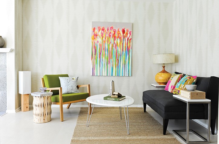
There are two essential elements to consider before we get into the decorating pieces we’ve been waiting to try out, that have a massive impact on the success of a rooms design: the walls and the grounding pieces of art and area rugs.
For the most part, spring creates a desire for lightness and organized design; a fast way to amp up an airy feel is to opt for fresh white walls. This could either mean a bright, energized paint option, or a chic tone-on-tone wallpaper.
Some people tend to shy away at the mere mention of wallpaper, vivid imagery of aggressive prints haunting their memories. However, today’s selection offers such a vast variety of all-white prints and textures, that it has become an easy go-to place to start for my team in almost any project.
When considering white paint for a room, colour comparison in the natural light of your own home is imperative: a white that is too ‘cold’ or stark will read as blue, especially with a traditional decor palette, while a white that’s too ‘warm’ or off-white can often appear dingy and dated, even when freshly painted.
Once we’ve got our “canvas” ready, it’s time to play with the grounding elements to the room.
If you’re wanting to make a big impact with a colour or trend, look to your art and area rugs; these act as larger furnishings, as their influence on the overall feel of a room is considerable.
I have a selection of area rugs that I play with seasonally, layering richer colours and textures in the colder months and swapping in brighter, simpler textures come spring.
As for art, I’m a big fan of choosing pieces that mean something to you, either found vintage art that tells you a story, or custom art with which you can create your own story.
Vancouver is a very supportive art community, and many of our top retailers carry the work of fabulous local artists. If you don’t see a piece that suits, you can speak to the shop and work with the artist on a custom option. Art, like good design, should be interactive, encouraging conversation; if what you hang on your walls says nothing to you or about you, it may not be the right piece for you.
A seasonal decor update, by nature, isn’t a permanent commitment to any one style... it’s a quick romance with new trends, ideas and inspirations and is intended to bring you a fresh perspective to your style, and then allow you to move on. Go on, have a spring [decor] fling
Spring [decor] fling: the callouts
A: THE TRENDS TO TRY:
Colour: Sapphire
My fave way to introduce this serene gemtone right now is through coloured glass accessories. Try mixing vintage with new to create a range of hues.
Pattern: Florals
For a fresh approach, play with the scale of the pattern - the best options are exaggerated, either super small or daringly oversized.
Metal: Gold Trifecta (rose gold, yellow gold, white gold)
A cheap cheat: use silver/ chrome pieces as your white gold, brass for yellow gold and copper as your rose gold to achieve a more industrial or budget-friendly option.
Decor item: Natural Stones & Crystals
My top pick is Selentine, a pretty white Moroccan salt crystal. It is believed to offer improved well-being while also amping up the pretty in your space - double duty design, I love it.
Decor Style: Traditional
Best reflected in 3 ways: furniture style, colour palette or room layout. To keep it current, try the look in only one of these elements at one time.
B: LOCAL ART ALERT:
Looking to support local yet get the look of world-class glamour? Check out Vancouver’s own fabulous fine artist, Zoe Pawlak. Already globally renowned for her canvas work, Zoe has recently paired with Burrit Bros Carpet & Flooring for a stunning line of area rugs, and also with local fashion design darling, Nicole Bridger for a fabric collection featuring Zoe’s design. www.zoepawlak.com
C: THE RIGHT WHITE:
I’m often asked about the differences in shades of whites, and what my top pick is for white paint for a room; whatever the space, my ultimate fave is a super crisp white by CIL called White Mountain (CP51). Uber fresh and bright by daylight, this white also takes on the soft warmth of ambient lighting once the sun has gone down. Available at Home Depot.
More design tips at AGoodChickToKnow.com.


