
A few months back I shared my journey into the realm of pet décor timed with a recent move; well, I'm at it again –I'm moving. Yes, again. With my designer digs for Fido nailed, this move has led me to a new décor dilemma: how to bring an Edwardian character house into 2015 and beyond without disturbing the charm or breaking the bank.
When considering what the biggest visual impact would be to transform the traditional elements of the house into an effect that suits my bohemian-meets-rock-n-roll style, the obvious option became the walls. When mulling over the many palettes for painting out the interior, it was actually a lack of colour that stood out. Choosing to white wash the entire space –walls, ceilings, trims, stairs –allows the space to take on a gallery inspired vibe, with the décor pieces able to stand out and set the tone.
Not only is a fresh white canvas perfect for the colour-commitment-phobes (accessories can be swapped out at any time to change the palette) but learning how to work with white walls and use them to your advantage can be the secret to successful design for renters who may not have another colour option for their space.
I've chosen to work with an all-white interior for many of my clients, and I've discovered some insider tricks to mastering the white wall. Most important is a great painter (someone who will do an awesome job and not gouge you on price); I've sworn by Martin Granatstein of Coastal Concepts for years, both for clients as well as my own homes.
With my install team lined up, I then work with a checklist of my key tips for a successful white room:
Choose the right white
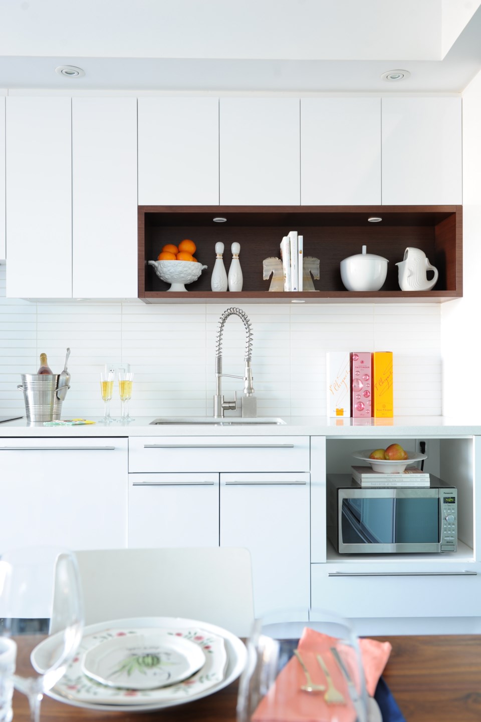
I believe that this is the fundamental step to a successful white space –whites can vary so dramatically, with each tone offering a different vibe. My personal preference is to always opt for a cool, stark white (White Mountain 50BB 83/020 by CIL to be exact) as it creates a chic gallery effect in natural light, yet is easily softened by ambient lighting. Some other whites I love are All White No. 2005 by Farrow & Ball, and Mirage White, Polar White and White Heaven, all by Benjamin Moore.
Tone on tone
Even if you've decided to paint out all your walls, trims and ceilings in the same white, as I did, playing up the tone-on-tone effect within the palette creates a stunning effect. Using the full range of whites, from bright whites to off-whites and ivories to even the light greys and natural linen tones in the details of the room gives a sense of depth to the space and amps up the interest in the room. One of my favourite ways to incorporate tone-on-tone is through wallpaper –whether it's a crisp white or white on off-white, the effect is stunning.
Play up texture
The idea here is to use texture in lieu of colour to create visual interest. Rather than choosing surfaces that match, opt for a wide variety of finishes within the room. With accessories, think about mixing matte finishes with glossy, or opting for pieces that have a textured surface. With the textiles in the room, blending fabrics and textures will give a much more striking effect than one all over sense of touch; if you have lightweight linen curtains, consider a heavily textured area rug to balance it out and choosing mismatched throw pillows rather than perfect pairs.
Layer to create depth
Even for a minimalist décor, when you're working with a monochromatic palette you can almost over-accessorize without it reading as overwhelming. It becomes substantially more important to incorporate and layer textiles like your throw blankets, curtains and area rugs (one of my fave tricks is layering rugs) to warm the space and avoid a stark or cold feel to the room. Even accessories can be layered –rather than just displaying your pretty new candle or found item on your coffee table or shelf, put it atop a curated collection of books or magazines to give it more presence and also add more depth to the overall appeal of the room.
Pops of colour create focus
Especially in an almost completely monochromatic space, the use of small hits of a focal colour make a strong statement. The eye is immediately drawn to those areas, with the subtler white details showing themselves with time. The best part about this use of colour is that smaller accessories can be swapped out at any time for a fresh take, and an all-white room supports a complete shift from one accent colour to another. Essentially, it becomes a perfect backdrop for your exploration of colour.


