Within the design community, the unveiling of the Pantone Colour of the Year represents a time to reset the palette and refresh our inspirations.
The Colour of the Year affects not only the inspirations we conjure within, but on a more literal level – the inspirations we will find in stores and online resources for the year to come.
This year, for the first time in history, Pantone – the leading authority on colour – released a two-tone colour way. 2016 is a milestone year for the colour association and community, as we are introduced to the powerful combination of Rose Quartz and Serenity; this is a doubled source of colour creativity for us to work with as an expression of mood and attitude within our designs.
Not only is this duo important for its direct colour options, but also as a reflection of what is happening socially and culturally on a global level. Discussions have started around this release of the muted pink and blue together, suggesting a softening of the lines between genders and gender equality, while also, according to Pantone, raising ideas around colour shaking off gender-specific imagery and gaining strength as a “form of expression”.
When speaking about the overall vibe and expected effect of this new colour way, Leatrice Eiseman – executive director of the Pantone Colour Institute – says, “Joined together Rose Quartz and Serenity demonstrate an inherent balance between a warmer embracing rose tone and the cooler tranquil blue, reflecting connection and wellness as well as a soothing sense of order and peace.”
As I have begun to seek out ways to introduce this into my own home and those of my clients, I have found a number of stellar items locally that either combine the duo or represent a singular aspect in a strong way.
My most coveted piece that I have found thus far is an oil painting by local-gone-international darling of the art world, Zoe Pawlak. With an impressive 30”x37” size, this oil-on-canvas piece, entitled Pull Up the Air (available online at ZoePawlak.com) not only represents both Serenity and Rose Quartz in its palette, but the figurative silhouette – to me – embodies the contrast of softness and strength that the colour way itself evokes.
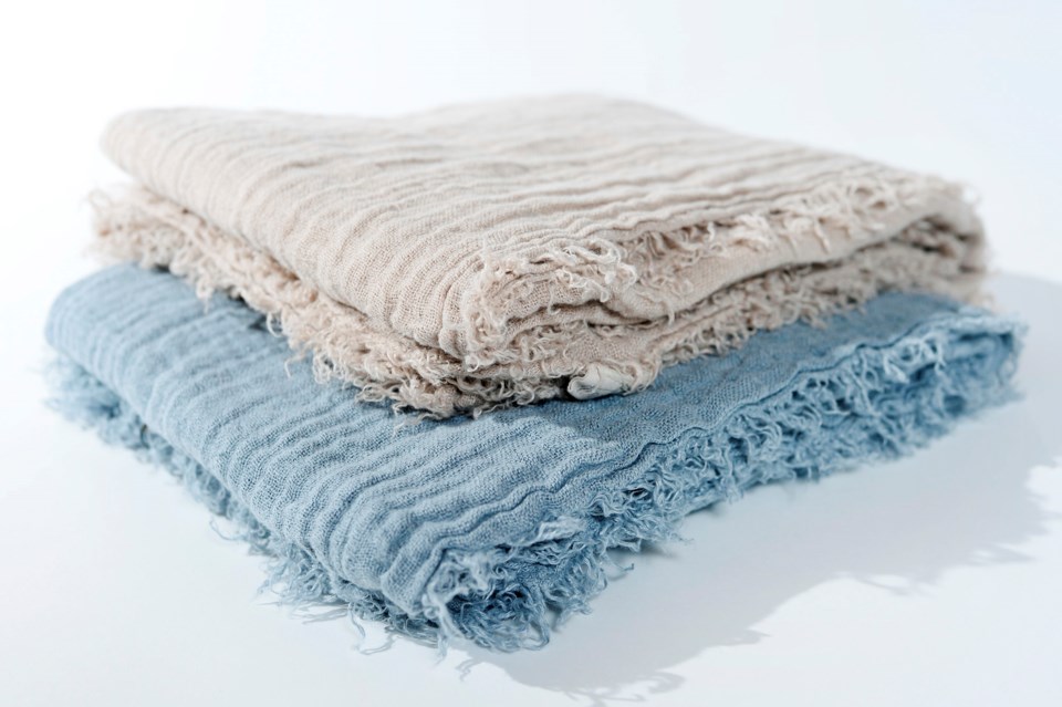
If you look to softer ways to introduce new colour ways into your space, textiles are a beautiful option. Orling & Wü offers the Rose Quartz and Serenity palettes in beautiful natural linen throw blankets in a lightweight texture that coincides with the fresh start of a new year.
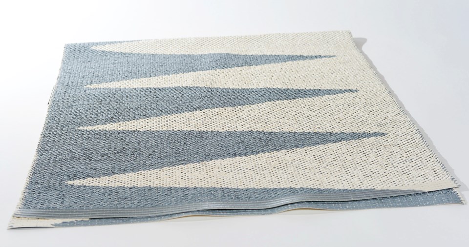
Underfoot is another fun use of colour that is often overlooked; bringing in trend colours via smaller area rugs is an unexpected yet striking effect. The indoor/outdoor options in the Serenity palette from Orling & Wü give you some play room on where to ‘be serene’, whether it the patio or kitchen.
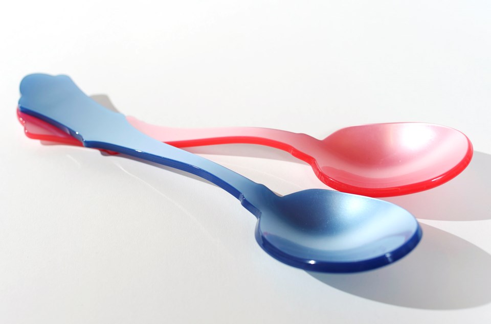
The kitchen is another place to test out fresh palettes that is consistently forgotten – colour doesn’t have to be bold in its application, in fact often the subtle uses are the most effective. Serving utensils give a fun twist to dinner, especially for the entertainer. The slightly more saturated versions of Rose Quartz and Serenity in the serving spoons shown are a bolder in palette yet subtle in context way to test out the new Pantone Colours of the Year.
For a more subdued, glamorous effect in the kitchen, the Red Raven Canyon Series dinnerware (pictured) from Nineteen Ten Home fits the bill with grace. Designed to emulate sunset hues from travels across the States, this collection specifically reflects the beauty seen in the Denali National Park. The entire line is created with handmade molds and hand-painted English porcelain; this series brings in elements of Rose Quartz as the primary palette, carefully contrasted with hues of golds and greens to make the tones pop.