As I glanced over my shoulder to change lanes, a shiny red BMW M3 zoomed by me as if it was being swept by a tornado.
The car appeared to be in a perfect condition, but then I quickly noticed the missing blue-and-white emblems from not only the hood and the trunk, but from all four cross-laced aluminum wheels as well.
Poor guy, I murmured, knowing that this BMW was another victim of vandals who snatch emblems and logos to make fashionable necklaces and belt buckles.
But how many of us, including the vandals, actually know the meaning behind emblems that represent these automobiles? Some have a long history behind them, while others portray something fairly simple.
Since many of the automotive emblems are obvious (such as Ford and Nissan who spell out their names), only the interesting and unusual ones will be discussed here.
The Japanese manufacturers have brought a number of unique, innovative vehicles to the market in the past several years, including the Toyota Prius, Scion FR-S, and Nissan Leaf models. However, I wish they had used more imagination with their emblems.
Many of them are similar in design, utilizing some kind of symbol inside an ellipse all chrome-plated. Nevertheless, they do have a meaning behind them.
Toyotas logo, for example, consists of three ellipses, whose two central points represent the heart of their customers and products. The ellipses symbolically join the two hearts, according to Toyota. Also, you can see the ellipsoidal-shaped T inside the large ellipse.
Acuras emblem is perhaps simpler to decipher. The word Acura symbolizes accuracy or accurate, and the emblem therefore depicts a caliper (an instrument used to measure objects accurately).
Imagine standing in the middle of a road, and looking straight ahead where the road seems to go infinitely. You just pictured yourself the symbolic shape of Infinitis logo: the road to infinity.
Mazda has an interesting history behind its logos. Many years ago, Mazda launched a new emblem for the export market. It was supposed to depict the sun and a flame standing for heartfelt passion. Whatever that means.
Then Mazda had to quickly alter the logo by rounding off the diamond inside the ellipse, because the emblem was similar to Renaults corporate logo (and they threatened to sue). So in 1998, Mazda redesigned the symbol once again.
The new version, which was developed by a well known corporate identification creator in Japan (Rei Yoshimura), shows a V in the centre of M. According to Mazda, it stands for creativity, flexibility, and vitality. Unlike the previous emblem, the new brand symbol is being used for all Mazda products throughout the world. Subarus emblem is one of the more distinctive ones, with six stars representing the original five companies that merged in 1953 to form a sixth: Fuji Heavy Industries. Subaru, by the way, appropriately means unite in Japanese.
What about the American brands? You bet, theyve got plenty of history behind their logos too.
Cadillacs original crest, which is considerably more elaborate yet very regal in appearance, is really the coat of arms of Le Sieur Antoine de la Mothe Cadillac. He was a French explorer who established the Ville dEtroit in 1701. Recently, Cadillac introduced a revised new emblem for its cars. Although its basic design is similar to the old one, the new version boasts a more slick, modernized look that should appeal to the younger crowd.
Chevrolets logo is much more unpretentious than Cadillacs and simply designates a bow tie. Pontiacs is simple too. Its stylized arrowhead was adopted after first appearing on the rear fenders of the 1954 Pontiac Star Chief.
Chryslers Pentastar emblem was created by Lippincott & Margulies design team, who wanted to symbolize Chryslers products as progressive and contemporary. The jewel-like clarity of the marks outline is supposed to reflect Chryslers precision-engineering traits.
Many years ago, however, Chrysler began using a different logo for its products. More nostalgic and rich looking, the new corporate symbol was developed by bringing back an old, classic emblem from Chryslers past.
European automakers insignia have more history and are probably more easily recognized. For example, virtually everyone recognizes Rolls Royces Spirit of Ecstasy and Mercedes three-pointed star.
The idea for Mercedes-Benzs three-pointed star originated from a postcard that Mr. Daimler sent to his wife. On it, he drew a guiding star and wrote, A star shall arise from here, and I hope that it will bring blessings to us and to our children. The form of the star, which was registered in 1909, was intended to symbolize the threefold nature of transport motorization: on land, sea, and in the air.
BMW produced aircraft engines during World War II, and the shape of the propeller became BMWs famous symbol.
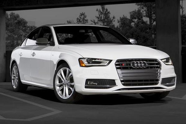
Audis interlocking rings denote the four companies, DKW, Horch, Wanderer, and Audi, that pooled resources together during the thirties to cope with the recession.
So here we have it. Every company trying to symbolically, historically, or visually represent themselves through a shiny piece of metal (actually plastic nowadays).
Lets just hope the teenage vandals will stop trying to do the same.


