Hollywood & Vine. Haight & Ashbury. Portage & Main. Davie & Denman. Great cities are composed of great intersections. Recognizable outside of their city limits, these spaces play host to significant historical events, define the cultural fabric of a place, and are the meeting point for diverse groups of people.
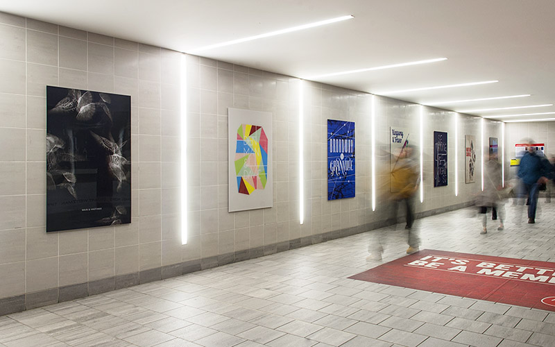
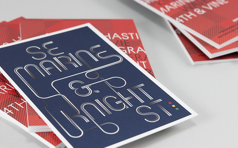
Seven graphic designers have teamed up with the Canada Line Public Art Program to present Intersections, a new exhibition inside Waterfront Station. The show explores seven essential Vancouver cross-streets with large-format posters created by 10four Design, Glasfurd and Walker, Post Projects, Seterah Shamdani, State Creative, Working Format, and Zach Bulick.
 Vancouver Is Awesome is featuring interviews with all of the seven participating designers.
Interview with Working Format (Ross Milne)What do you do? What are you currently working on?
I’m one half of Working Format, a graphic design studio dedicated to highly crafted work and a strong respect for all things typographic. We recently finished the branding and packaging for Kooshoo , a lifestyle accessories line and are currently helping one of Vancouver’s most respected retailers transition to the web. At any given time, we’re also knee deep in our own projects, such as The Platform Gallery or the design of custom typefaces.
Tell us more about your thoughts or relationship to the geographic intersection you worked with for the Intersections exhibition.
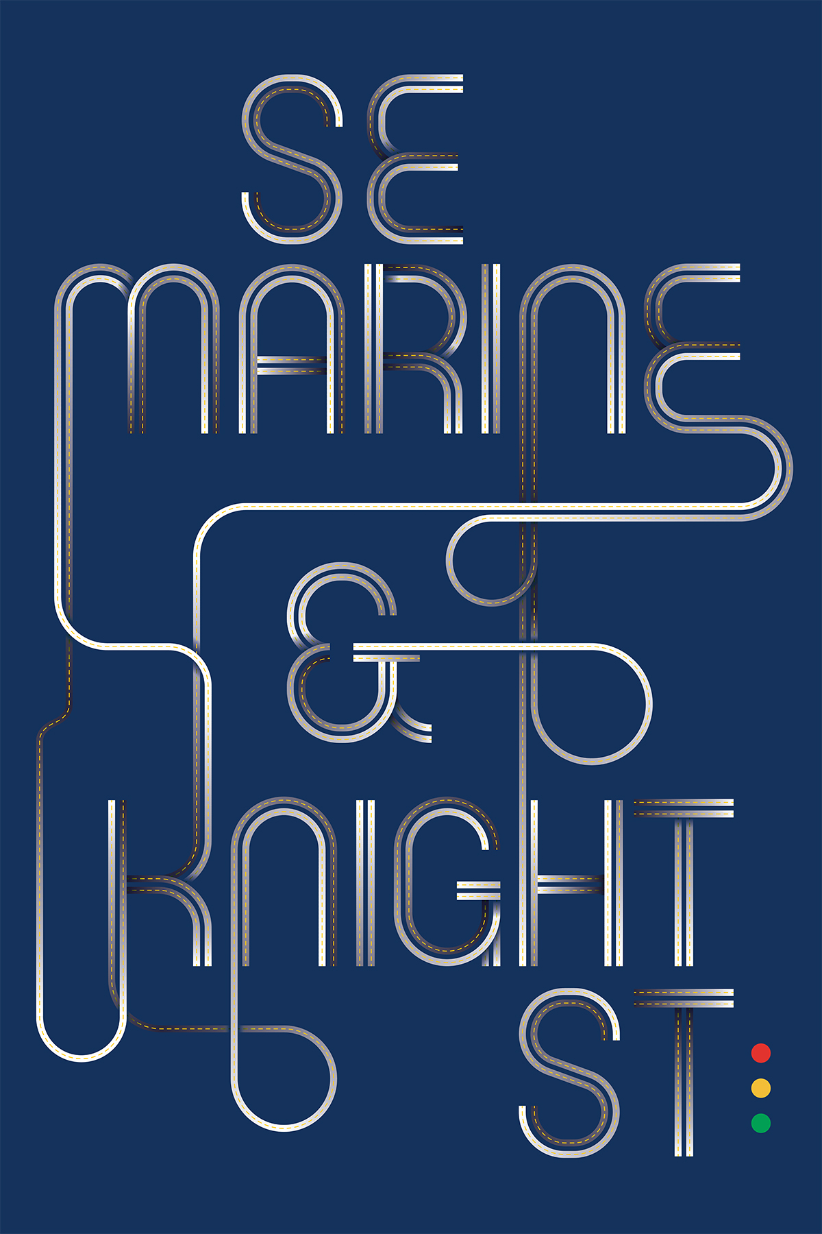
Unlike some of the other intersections chosen for the exhibition, SE Marine & Knight St doesn’t have a wealth of history or culture to draw from. My personal relationship to the intersection is limited to the large warehouse stores that have been relegated to the South East, as well as my own comings and goings from Vancouver.
What was your approach in designing the poster?
SE Marine & Knight St is one of Vancouver’s main arterial routes. For a city that prides itself on mixed transportation, the car dependent nature of this intersection makes it essential, but hardly worth celebrating. I wanted to draw from our typographic interests and construct the name of the intersection out of streets. The streets are intended to weave in and out, connecting one word to the next. Shadows and highlights lend dimensionality, but also to convey the heavy steel, cement and exhaust found at the intersection.
Intersections is part of Platform Gallery, an online archive of exhibitions inviting Vancouver-based designers to celebrate and critique the city we live in. Past and present exhibitions are shown at Waterfront Station’s Canada Line platform and produced in collaboration with the Canada Line Public Art Program. Visit Platform Gallery on Facebook and Twitter and be sure to check out Intersections for yourself!