
In the 2020-21 season, the NHL introduced a new jersey concept: Reverse Retro. This concept saw every NHL team take a jersey from their past and give it a twist with new colours or logos. Perhaps the NHL saw the NBA’s wild assortment of jerseys and thought they ought to get in on that merchandising money themselves.
Some teams embraced the potential for this concept, creating some fantastic or bizarre designs, while others played it safe and, frankly, boring.
The Vancouver Canucks were somewhere in between. Instead of going back several decades for a vintage design, they looked to the early 2000’s with a take on their gradient third jersey, updating it in blue and green instead of the original navy and maroon.
It’s a decent look and better than many of the other Reverse Retro designs but it still felt a bit like a missed opportunity. The Canucks have some truly wild jerseys in their history and they could have come up with something a little bit more unique and out there — a flying-V, spaghetti skate, or Millionaires jersey in royal blue and kelly green would have been a lot more fun than the sprite can look they went with.
Speaking of cans, the Canucks will get a second kick at one this coming season as the Reverse Retro jerseys are making a comeback with all new designs. According to a leak over the weekend, the Canucks will be going decidedly more vintage with their second attempt.
The jersey was initially spotted on Facebook Marketplace, with a seller posting the likely shadily-acquired jersey for the low price of just $89.
According to Chris Smith at Icethetics, the jersey isn’t a fake, even if it was being sold for a fake-sounding price. Smith has all sorts of contacts in the hockey jersey world — if he says it’s legitimate, it’s legitimate.
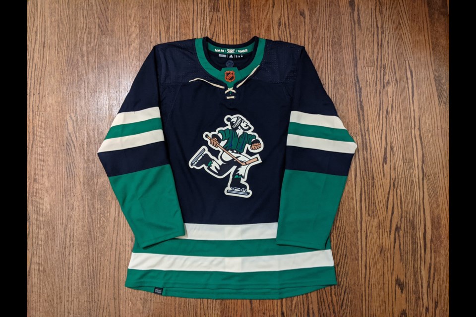
The jersey features the original Johnny Canuck logo from the pre-NHL Canucks, who played in the WHL. They first wore the Johnny Canuck logo in the 1962-63 season on red, white, and blue jerseys.
The Reverse Retro is clearly a take on these jerseys, right down to the stripes on the sleeves and bottom of the jersey.
The Canucks already brought back Johnny Canuck one year ago, using the old-school logo for their AHL affiliate, the Abbotsford Canucks. The Reverse Retro logo, however, is a little bit different from either the Abbotsford logo or the original WHL Canucks logo.
That became clear when more photos of the leak popped up in hockey jersey group chats.
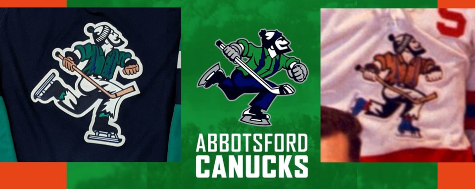
Here are the three Johnny Canuck logos — the Reverse Retro on the left, Abbotsford in the middle, and the original WHL logo on the right. It’s surprisingly hard to find a clean image of the Johnny Canucks logo that actually appeared on the Canucks’ jerseys, so I apologize for the fuzziness of the latter image.
The Abbotsford logo is much more modernized, with an aggressive forward lean in his skating stride, a more angular beard, cuffed pants, and more modern-looking skates.
The Reverse Retro logo, on the other hand, retains the same design as the original: a more upright skating stride, a thinner stick, vintage skates, and ragged pants.
There are some differences, however. The beard on the Reverse Retro Johnny Canuck is more curved than the original and he’s a bit slimmer as well than the more robust original.
There are some other intriguing details to the jersey. The inside of the colour has the year 1962, indicating the year the original jersey was introduced.
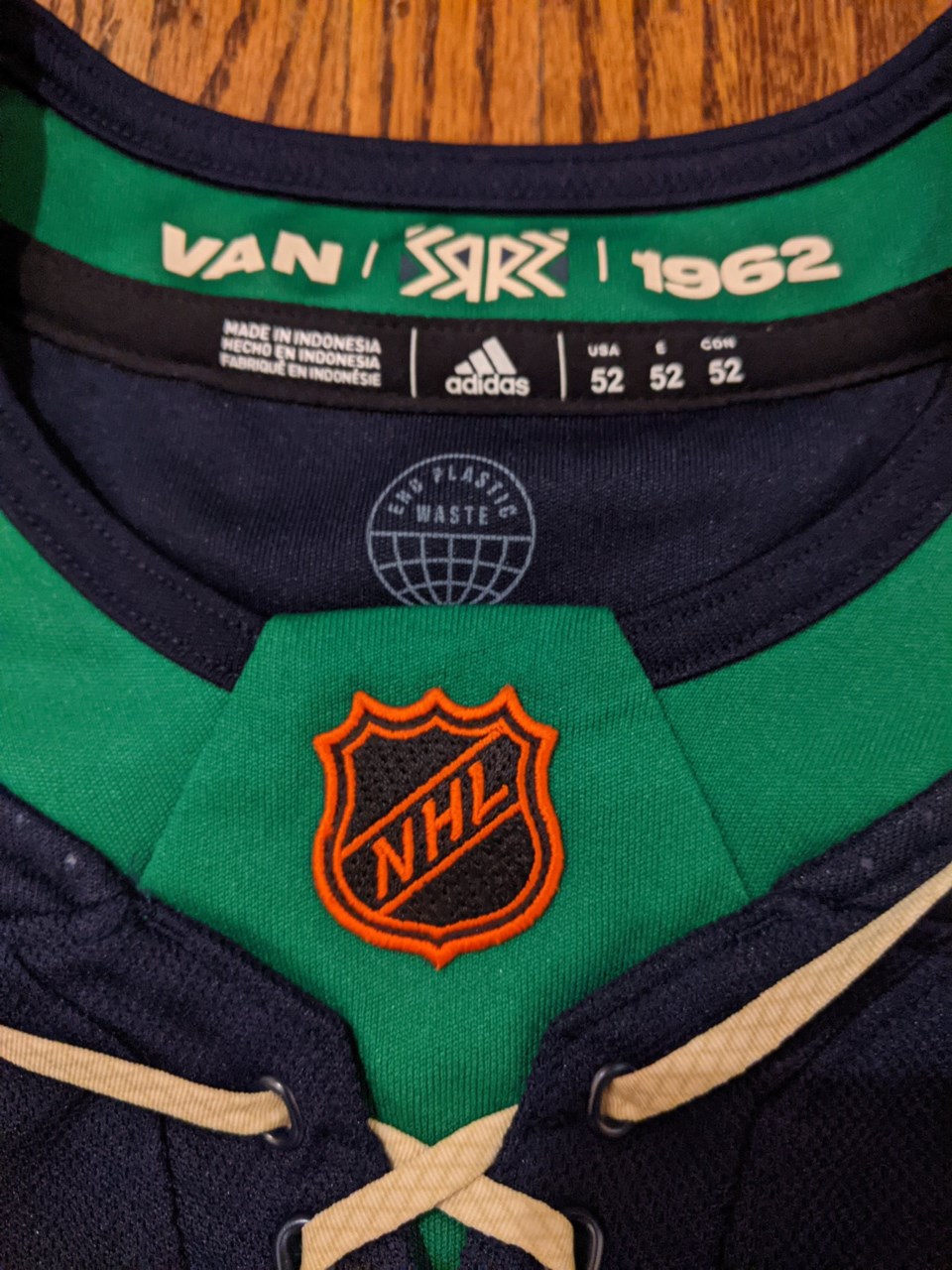
In addition, the silver NHL logo has been replaced by a retro-inspired orange NHL logo, though the original orange logo had the letters angled in the opposite direction. In other words, the NHL logo itself is a Reverse Retro design, taking the vintage colours and combining them with the modern logo.
There’s one other intriguing element to the jersey: the empty shoulders. The WHL Canucks didn’t have a shoulder yoke on their jersey but they did have on more design element in the upper quadrant: numbers and letters.
The WHL Canucks had their numbers on the front of their jerseys on the upper right, where the captain and alternate captain letters go on modern jerseys. The “C” and “A” for the captain and alternates instead went on the upper left.
Since the leaked jersey didn’t have a name or number, will the Canucks be putting numbers and letters on the front of the Reverse Retro jersey?


