
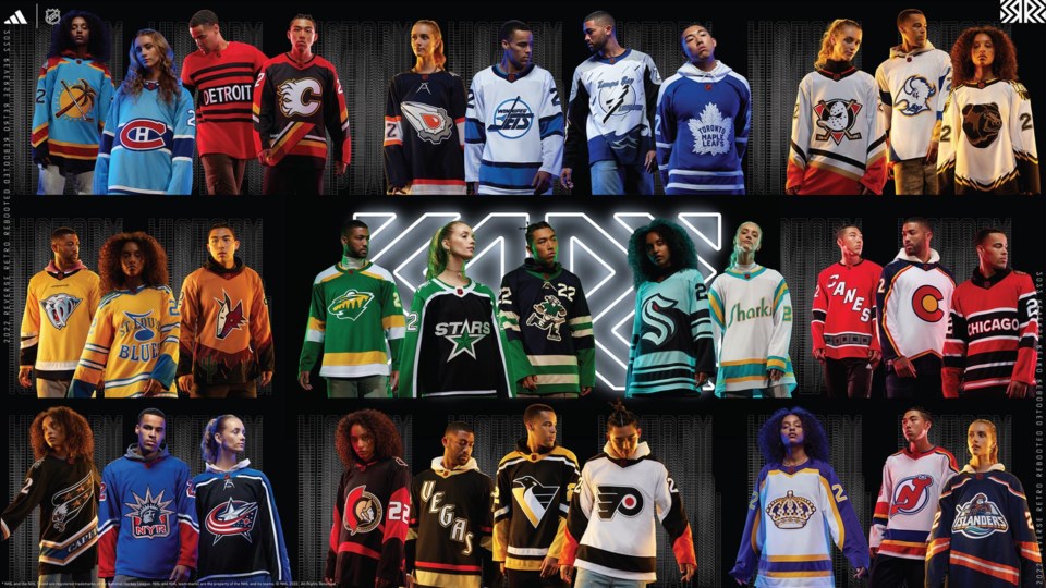
The NHL’s Reverse Retro jerseys were a hit in the 2020-21 season. The “throwback with a twist” concept was a potent combination of nostalgia, unique designs, and the type of goofy, weird fun that the NHL rarely embraces.
The Canucks played it relatively safe compared to some of the other Reverse Retro designs in the 2020-21 season, bringing back the gradient third jersey that was introduced in 2001, updating it from the original maroon and navy to blue and kelly green to match their current colour scheme. It was better than many of the other Reverse Retro jerseys, but it wasn’t as creative and unique as the best of the bunch.
This season, the Reverse Retro jerseys are back, with every NHL team coming up with a new design — or, rather, a new twist on an old design.
The Vancouver Canucks’ new Reverse Retro jersey was leaked months ago and the leak was proven legitimate when the jerseys were officially unveiled on Thursday.
The jersey is a throwback to the pre-NHL Canucks, when they played in the old Western Hockey League, using the same Johnny Canuck logo that they have also repurposed for their AHL affiliate, the Abbotsford Canucks. That’s the retro element.
The reverse element is the updated colours — not quite the royal blue and kelly green that the Canucks use on their main jerseys, but a much darker midnight blue.
So, where does the Canucks’ new Retro Reverse jersey rank among the other 31 NHL teams? Let’s count them down.
32 | Calgary Flames
According to Flames fans, the upward diagonal striping that cuts across the horizontal stripes along the bottom of the jersey is known as the “pedestal.”
According to everyone else, it’s known as godawful.
This is just ugly and not in a quirky, fun way like some of the other Reverse Retro jerseys that we’ll get to, where the ugliness is part of its charm. This just looks bad.
It doesn’t help that the “pedestal” disappears into a thick seam along the middle of the jersey rather than it being printed on the fabric like the original “pedestal” jersey to which this is paying homage. The seam gives this jersey a patchwork feel that makes it seem thrown together instead of an intentional choice.
31 | Seattle Kraken
The Kraken had a difficult task as the NHL’s newest expansion team, as they have no team history to draw upon. They had a smart idea, then, to pay tribute to Seattle’s hockey history by making an homage to the Seattle Ironmen, who played in the PCHL from 1944 to 1952.
Then they completely missed the mark by using their modern, massive “S” logo, completely erasing any of the retro charm that they could have evoked by just updating the original Ironmen jerseys with Kraken colours.
Seriously, look at what could have been in the concept art above. What a missed opportunity.
30 | Detroit Red Wings
29 | Chicago Blackhawks
These two Original Six teams basically made the same boring jersey. These are dull, unimaginative, and just plain bad.
The only way these two jerseys can be redeemed is if they both wear them during the same game so that pure chaos can ensue.
28 | Columbus Blue Jackets
These feel very lazy. It’s just their third jersey introduced in 2003 with slightly different colours. Technically, it fits the brief of the Reverse Retro concept but it misses the mark in so many ways.
I hate that it’s black. I hate that it just uses their modern logo instead of their original logo or their weird alternate logo featuring their mascot, Stinger. They could have used their alternate cannon logo or their Union hat logo. So many possibilities that would have been more interesting than this.
Making it even worse, it looks like there’s navy blue piping next to the lighter blue, so this jersey has both black and navy blue on it, which is wrong in so many ways.
Maybe I’m being too harsh, but I don’t like anything about this jersey.
27 | Carolina Hurricanes
I cannot fathom why the Hurricanes would choose to do a Reverse Retro version of their worst jersey. They nailed the Reverse Retro concept last time when they brought back the Hartford Whalers jerseys, so it’s disappointing that their first time tackling an actual Hurricanes jersey misses the mark so badly.
First of all, it’s a diagonal wordmark, which doesn’t work unless you’re the New York Rangers. Secondly, it’s a wordmark of a team nickname, so that’s even worse.
Worst of all, it’s not even retro. The “Canes” jerseys are still the team’s current third jerseys, so this is just a colour-swapped version of a jersey they still wear.
The trouble with the Hurricanes is that they don’t really have a long jersey history — their jerseys have remained essentially unchanged since 1997 — but that just represents a challenge that should be faced with creativity and this is the opposite of creativity.
26 | Ottawa Senators
These really don’t work for me. Throwing back to their 1997 jerseys with the “swoosh” instead of the typical stripes is a good idea. The problem is that the logo is massive on the front, so most of the “swoosh” gets lost, especially because there’s no colour variation within the “swoosh.”
Instead, it just looks like there’s a random red line jutting out of the logo, almost as if the logo just got stabbed in the neck and is now bleeding profusely.
The massive numbers on the back also hide most of the “swoosh,” so it just looks random and chaotic. The font used for the name and numbers is also bizarre, with the chunky dadbod middle of the “S” and the “2”. It’s a no for me.
25 | Toronto Maple Leafs
This is…just a regular Leafs jersey.
I’m sure Leafs fans will come out of the woodwork explaining all of the differences between this and all of their other jerseys, but they’re so minute that it doesn’t really matter. It’s not a bad jersey and I like the shoulder yoke, but it doesn’t really do anything fun with the Reverse Retro concept.
24 | Edmonton Oilers
The Oilers at least understood the assignment, bringing up an unusual jersey from their past and giving it a new spin. This jersey was originally designed by comic book artist Todd McFarlane, a longtime Oilers fan and one-time part owner of the team.
I want to like this more, but some of the choices made just don’t quite work. I don’t understand why the logo is mostly silver instead of the same darker grey on the gear. The orange doesn’t work with either the silver or the darker blue of the jersey compared to the lighter blue on their regular jerseys.
If they were committed to the dark blue jerseys, they should have gone with the copper colour from that era instead of the orange. If they were committed to the orange, they should have gone with the lighter blue from their current jerseys.
And then there’s the white on the sleeves that clashes with the silver in the logo. It’s just all wrong.
23 | Winnipeg Jets
The throwback to the nineties is the right choice and that logo is great, but these jerseys are just so very, very bland.
The modern Jets jerseys have some red in them with the maple leaf in their logo, so why couldn’t they incorporate some red into these Retro Reverse jerseys to give them a little bit more life?
Well, wouldja look at that. The ad on the jersey for Canada Life is red and literally says “life.” Not really what I meant.
22 | Nashville Predators
The original version of this jersey is infamously ugly, with a sickly mustard colour and an overly-busy logo. The only “reverse” element of this jersey is the change to their modern yellow colour, which is a great colour that really pops on television, but doesn’t really change much about the original jersey.
I don’t hate this jersey like some of the ones lower in the rankings, but it’s still a miss. If the Predators had been a bit more creative with the colour choices or gotten rid of the “Nashville” wordmark, it would rank a bit higher.
21 | Vancouver Canucks
This may be controversial, but I really don’t like the Canucks’ new Retro Reverse jerseys. The block of green on the sleeves feels out of place and I’m not sure why they didn’t go with royal blue instead of the darker navy blue for the main colour. I'm also not a huge fan of the stripes on the bottom, though I can't quite articulate why.
Honestly, they would rank higher if the Canucks hadn’t already used the Johnny Canuck logo for their AHL team. As it is, this looks too much like a third jersey for the Abbotsford Canucks instead of an NHL jersey.
As a result, it will surely lead to far too many easy jokes about the Canucks playing like an AHL team.
It’s just disappointing given the varied history of Canucks jerseys they could have pulled from. The opportunity to do a royal blue and kelly green version of their infamous flying V jerseys has been there all along.
That said, I know there are a lot of people excited to see the Canucks sporting Johnny Canuck, so I’m sure this jersey will have its supporters. It’s also definitively better than many of the other Reverse Retro jerseys. It just doesn’t work for me.
20 | Dallas Stars
The Stars badly missed the mark with their last Retro Reverse jersey, which was plain white, bland, and ugly. It just didn’t work.
This is better, with an update to their original home jerseys with shimmery silver replacing the shimmery gold of the originals. There are enough twists on the original colours to make this feel like a proper Reverse Retro jersey and it’s a pretty clean look. Not one of the best but a solid effort.
19 | Vegas Golden Knights
Stop it with the diagonal wordmarks.
The Golden Knights had the right idea by designing a jersey that they might have worn in an alternate history where they joined the NHL in the nineties, but they lose marks for going with a diagonal wordmark. That said, there was a proliferation of diagonal wordmarks in that era, so it's at least period accurate.
They get some marks back because of the wackiness of the letters glowing in the dark, paying homage to the neon lights on the Las Vegas Strip. And I have to give them credit for a unique font choice that reflects their home city.
18 | Philadelphia Flyers
These jerseys would rank far lower if it were not for the inspired choice to wear Cooperalls during warmups every time they wear them this season.
That’s getting into the spirit of the Reverse Retro theme in a way that I can really appreciate.
The jerseys themselves are barely different from the ones they wore with the Cooperalls — they just flip the black and the orange on the shoulders and sleeves — but adding the long pants is doing Reverse Retro right.
17 | Washington Capitals
The Capitals did well with their first Reverse Retro jersey, a take on their nineties “screaming eagle” jersey in a bold red colour.
This is the same jersey, except it’s in the original “screaming eagle” colours, except flipped to have black as the main colour.
It’s not bad but it’s also another black jersey in a sea of black jerseys and far less interesting than the red version. Returning to the same well knocks them down the rankings.
16 | Pittsburgh Penguins
This is a fine jersey and I don’t really have much to say about it. They brought back their nineties “robo-penguin” logo, switched up the colours, job done.
I would have preferred they did something fun with the weird striping and gradients they used with this logo back in the nineties, but this is fine. It’s fine.
15 | Colorado Avalanche
I really want to like this more than I do. I appreciate the Avalanche for doing something distinctly different with their design and colours, so it gets high marks there, but there’s something not quite right.
Perhaps it’s because the Avalanche don’t acknowledge at all that these are the original colours and logo for the Colorado Rockies, who played in the NHL from 1976 to 1982. Yes, the logo and colours and pulled from the Colorado state flag, but not acknowledging that element of NHL history in Colorado feels strange.
The Avalanche nailed it with their tribute to the Quebec Nordiques with their last Reverse Retro jersey, so it feels like a missed opportunity to so blatantly do a Rockies jersey without twisting it a little — either changing the colours of the Rockies jersey to modern Avalanche colours or doing the Avalanche logo in Rockies colours.
Of course, the Rockies moved east and became the New Jersey Devils — more on that in a moment — so the Avalanche may not own the rights to the Rockies logo.
14 | New York Rangers
This is a solid jersey, bringing back the statue of liberty logo but using the lighter blue and red colours compared to when they originally wore that logo. The trouble is, it’s the exact same logo they used last time for their Retro Reverse jersey. All that’s changed is the colours.
It’s a better design than their last Retro Reverse jersey, with colours that really pop, so perhaps they were just correcting where they went wrong last time.
13 | Buffalo Sabres
The Sabres are already bringing back the “goathead” jersey in its original black-and-red colours this season, but it’s still a great choice to use it for a Reverse Retro jersey, updating the “goathead” with their current blue and yellow colour scheme.
I almost had it in my top ten, but there’s something about the logo on the white jersey where it just doesn’t quite pop as much as it should. It’s so close and I’m sure Sabres fans will love it, but it’s not quite there for me.
12 | Tampa Bay Lightning
This is what I wanted from the Lightning’s last Reverse Retro jersey but now that I have it, I’m not sure I want it anymore.
The Lightning get credit for their willingness to be weird and embrace one of their most off-the-wall jerseys they’ve ever worn, with so many bonkers details, like the driving rain, the wave along the bottom, the lightning down the sleeves, and the “electrified” numbers. This jersey is pure chaos and is exactly the type of jersey that should be revisited with the Reverse Retro concept.
I wanted to like this so much, but the choice to use white as the main colour doesn’t work. The “rain” in a white “sky” makes no sense, losing the story of the jersey.
Here’s what it should have been: black as the main “sky” colour, with a blue wave along the bottom:
Still, there’s a lot of nostalgia here and you have to give the Lightning credit for the bold choice.
11 | Minnesota Wild
These are great jerseys. I like them. They’re also exactly the same as their Reverse Retro jerseys from last time, except with green as the main colour.
I deducted points for a lack of originality, knocking them out of the top ten, but it’s still a clean and crisp look, so they don’t fall far.
10 | New Jersey Devils
The Devils were never going to match the greatness of their first Reverse Retro jersey, which felt like a jersey that had always existed by using dark green as a main colour for the first time in their history.
Still, this is a pretty great take on the concept, taking their modern logo and incorporating the colours of the Colorado Rockies — see, told you we’d get back to them.
Unlike their first Reverse Retro, this wouldn’t work as a permanent jersey, but as a unique take on the team’s history for a few games, it’s great.
9 | New York Islanders
This is what Reverse Retro is all about — taking the opportunity to have a little fun with your team’s jersey history. The Islanders brought back the angry fisherman and updated him with current Islanders colours.
But…there’s something a little off. As pointed out by several Islanders fans, they didn’t pay attention to the details, with the stripes on the bottom not lining up on the right side of the jersey, which is absolutely baffling.
It’s also missing a lot of the kooky details that made the fisherman jersey so unique. The stripes along the bottom were originally a wave design that was echoed by the shoulder yoke. The numbers and names on the back also followed that waviness in the original jersey.
By not fully embracing the oddity of the original, this jersey gets knocked down several pegs. I originally had this jersey in my top three but debated taking it out of the top ten altogether. In the end, the angry fisherman logo was enough to keep it ranked fairly high.
8 | Anaheim Ducks
Using the classic Mighty Ducks logo in modern Ducks colours is exactly what the Reverse Retro concept is all about. These look fantastic and, quite frankly, better than their current logo and jersey. They should just switch to these full-time.
Or they could just go back to their teal-and-eggplant colours with this design, which seems to be what Ducks fans want.
7 | Los Angeles Kings
Much like the Devils’ green and red jersey, this Kings jersey seems like it must have already existed, but the Kings’ classic crown logo was always on purple or gold and never on white.
That makes this a great take on the Reverse Retro concept and, after having the best Reverse Retro last time around, makes them 2-for-2.
6 | Boston Bruins
This is what Reverse Retro is all about — bringing back a bonkers jersey design to cash in on nostalgia.
These “Pooh Bear” jerseys are a lot of fun and a lot more palatable in white than the original yellow. I wanted them to bring back this logo for their last Reverse Retro jersey and I’m delighted they did so this time around.
Is it a great jersey in terms of aesthetics? Not really, but it's a great Reverse Retro jersey.
5 | St. Louis Blues
I appreciate a deep cut. The Blues never actually wore this jersey — it’s the original prototype design when the Blues first entered the NHL and it was actually drawn by then-general manager Lynn Patrick.
It’s a distinct look and making it a bright gold jersey is a great choice — it’s bold, it’s different, and it’s fun. Other teams should take note.
4 | Montreal Canadiens
It’s tough for the Canadiens to do much with the Reverse Retro concept considering they’ve had basically the exact same jersey for over a century, but they somehow keep nailing it.
Their last Reverse Retro gave them a blue jersey for the first time in their history but made it a distinct Canadiens blue that worked perfectly with their brand. This time around, they’ve dug into Montreal sports history to pay homage to the Montreal Expos with a gorgeous baby blue jersey.
As befitting an homage to a baseball team, this is a home run.
3 | Arizona Coyotes
The Coyotes are wild, man. Their last Reverse Retro was essentially the same as this one, but with a bold purple colour as their main colour. Call those ones the nighttime jerseys and these ones the daytime, giving them an unexpected burnt sienna colour that evokes the heat of the desert.
These are really out there but that's what I appreciates about them.
2 | San Jose Sharks
These are glorious.
Taking the California Golden Seals jerseys and changing them to say Sharks instead is such a brilliantly simple idea and the end result is beautiful. These are clean-looking jerseys with unique colours and some smart choices in how they updated the design.
This is a great look and nearly took first place.
1 | Florida Panthers
This is perfection.
The Panthers took the basic template of their 1998 jerseys, made their alternate palm tree logo their main logo, and then took the baby blue trim colour from their 2009 alternates and made it the primary colour.
The end result is a jersey that perfectly evokes Florida in a way that no other Panthers jersey ever has. These are bright, fun, and should immediately become the team’s permanent third jersey.


